Hebrew College Minimum Visual Branding Compliance Standards
When we all work together, we can strengthen the Hebrew College brand. We appreciate your partnership when creating stand-alone pieces that the Marketing team does not have the bandwidth to help create. Please note the below standards and feel free to come to us to review materials you have created for your program.
When creating a piece of marketing or informational material meant for an internal or external audience, these 4 elements are needed to ensure brand compliance:
- LOGO
The Hebrew College logo should appear on your document at least once. This will likely be in the top or bottom 1/3 of the document. Approved logo formats include:
These logos should always be sized proportionally and never stretched or condensed to fit a space.
If placing the logo on a dark color background a white transparent logo should always be used.
- FONTS AND USAGE GUIDELINES
The body text of your document should always be in a pre-approved serif OR sans-serif font. Please select ONE of these fonts for your body copy:
SANS-SERIF: Flama, Trade Gothic, Benton Sans, Trebuchet MS or Verdana
SERIF: BentonModern, Garamond, or Times New Roman
The header font can be in any of the above Font-Families or in a theme appropriate decorative font. If a decorative font is used, the marketing team will need to review the piece before it’s released.
- HEBREW COLLEGE INFORMATION
At a minimum, every piece of Hebrew College material should have hebrewcollege.edu somewhere outside of the body copy. If the piece is letter sized (8.5×11 or larger) it may also include this boiler plate in the footer:
HEBREW COLLEGE is a Boston-area institution of Jewish learning and leadership with a dual focus on community learning and graduate leadership — each of which strengthens the other — within a pluralistic environment of open inquiry, depth, creativity, and compassion.
- COLOR AND GRAPHICS SYSTEM
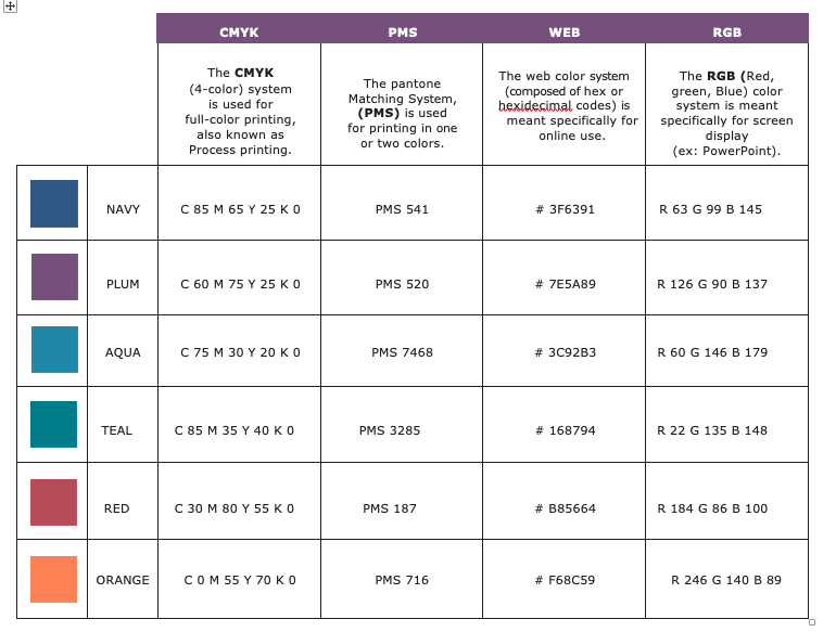
Any background color or header color should be one of the below. Body copy should be in Navy, Grey, Black or Plum. If there is copy on a dark or bright background it can also be white.
Photos or texture/patterned backgrounds can be used in combination with these solid colors. Icons, such as webdings or dingbats can be used to offset bullet points and create visuals interest. These should also be in the color palette provided or black, grey or white. If one of these graphic elements are used, the marketing team will need to review the piece before it’s released.


